Footer Basics
As UX professionals, we tend to dedicate our time and energy to everything above the fold. That’s because global navigation, search, and high-priority content are positioned above the fold and users tend to spend a disproportionate amount of their time at the top of any given page. Consequently, footers, which appear at the bottom of web pages, get the short end of the UX time and resource budget. However, you should still pay attention to footers because they can greatly enhance a user’s experience.
Definition: A website’s footer is an area located at the bottom of every page on a website, below the main body content.
The term “footer” comes from the print world, in which the “footer” is a consistent design element that is seen across all pages of a document. However, as we explained 20 years ago, the difference between print design and web design means that design elements like footers change their meaning (in this case by becoming actionable) when they’re ported from print to online.
Website footers of the past were either small utility areas with little information or big dumping grounds for miscellaneous links. Visually, they often contained tiny text that was hardly legible. Today, footers have matured and now serve as an important reference point for people as they complete a variety of tasks on websites.
People Use Footers
While footers get less attention than the top of the page, they still receive a fair amount of use. These are the two most common use cases for footers:
- Users scan or read the page and either don’t find what they want or need more information. They scroll to the bottom of a page and use the footer as:
- A second chance to be convinced
For example, maybe a user has decided, after reading all the details, that she doesn’t want to sign up for a bank account, but she was still impressed with the banking institution and wants to become a customer. The footer is a good opportunity to remind or teach potential customers about the company’s other offerings. - A last resort for hard-to-find content
Sometimes users turn to the footer for additional options that might not be present in the global navigation. For example, those interested in applying for a job with an ecommerce company — a task that is different from those of the typical e-commerce customer—might look to the footer for relevant information. - Users intentionally scroll to the footer to find information they expect to appear there, such as contact information, details about the company, social media posts or links, or even to discover new or related content on the site. Some users even use the footer for navigation: when they have already scrolled to the end of a page, because the footer is in close proximity, they use that instead of scrolling to the top for the global navigation.
In both of these cases, no matter what content ends up in the footer, that footer should be consistent, predictable, and easily discoverable. Consider these use cases, your website’s goal, and your footer’s goal when determining which type of footer to offer and which content to offer in the footer.
While satisfying these user scenarios may not be the absolutely highest-priority goal for a website, designing a good footer is still a worthy endeavor, because footers have a particularly wonderful usability characteristic: they will never get in the way of users who get their needs satisfied higher up on the page. Thus, except for overly bloated footers that could delay page download or rendering, a footer is a cost-free addition to the user experience. It can help, but it can’t hurt.
Footer Elements
Site designers choose many different types of content for their footers for various reasons. Footer elements can be combined depending on the business and user goals. Here are some of the most common footer components, examples, and recommended situations in which to use them:
- Utility links
- Doormat navigation
- Secondary-task links
- Site map
- Testimonials or awards
- Brands within the organization
- Customer engagement (email newsletters and social media)

Utility Links
Most sites, at a minimum, tend to include utility navigation in the footer, pointing to:
- contact information: the company’s address, phone number, and link to live chat
- customer-service information
- privacy policy
- terms of use
While many sites have utility navigation located in the top-most areas of their site, the footer is where users look when they search for these specific items. Users will often go directly to the footer to find contact information or locate ways to get customer support. Whether you have links to these utility items at the top of your page or not, always include them in the footer as well. (A utility area at the top of the page should still be used for tools-like utilities, such as search, login/account information, and language-selection.)
Use for: all sites


Doormat Navigation
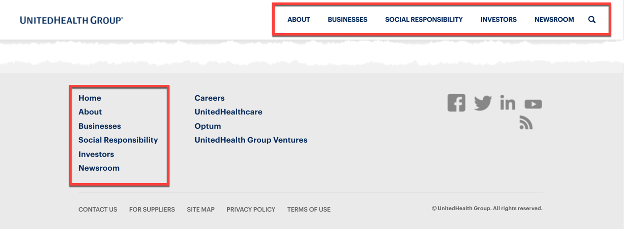
Like the physical mat at people’s homes, a doormat navigation is the first thing you see when you arrive and the last thing you see when you leave — that is, it is included both at the top and the bottom of the page. Thus, a footer can include the global navigation. This component is beneficial when the pages are long (as it is the case with many modern mobile designs), since it allows users to quickly move to a different section of the site without scrolling back to reach the main navigation.
Use for: sites with long pages, especially if the global navigation is unavailable while at the bottom of the page
Secondary Tasks
A footer may contain links to secondary tasks of interest to the user. Some examples of secondary tasks include:
- applying for a job with the company
- tasks for content creators
- accessing investor information
- finding documentation or specifications of a product or service
- accessing media kits and other PR information
- finding affiliates of the company
These secondary tasks are usually not present in the global navigation or utility navigation. This type of footer content is common on sites with multiple user groups with different user journeys.
Use for: helping users find secondary content that might not be directly related to the main purpose of the site
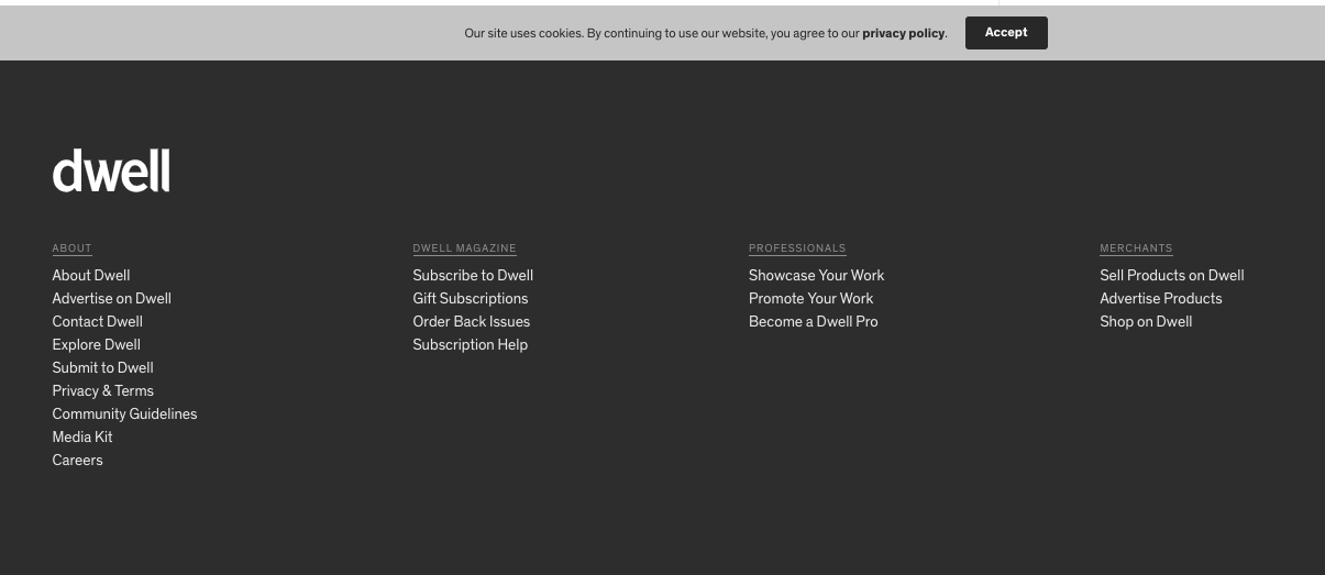
For example, Dwell Magazine’s website showcases categories outside the magazine topics, including About, Dwell Magazine, Professionals, and Merchants — which might interest its secondary user groups: media and design professionals, merchants, investors, and advertisers (and prospective employees).
Site Map
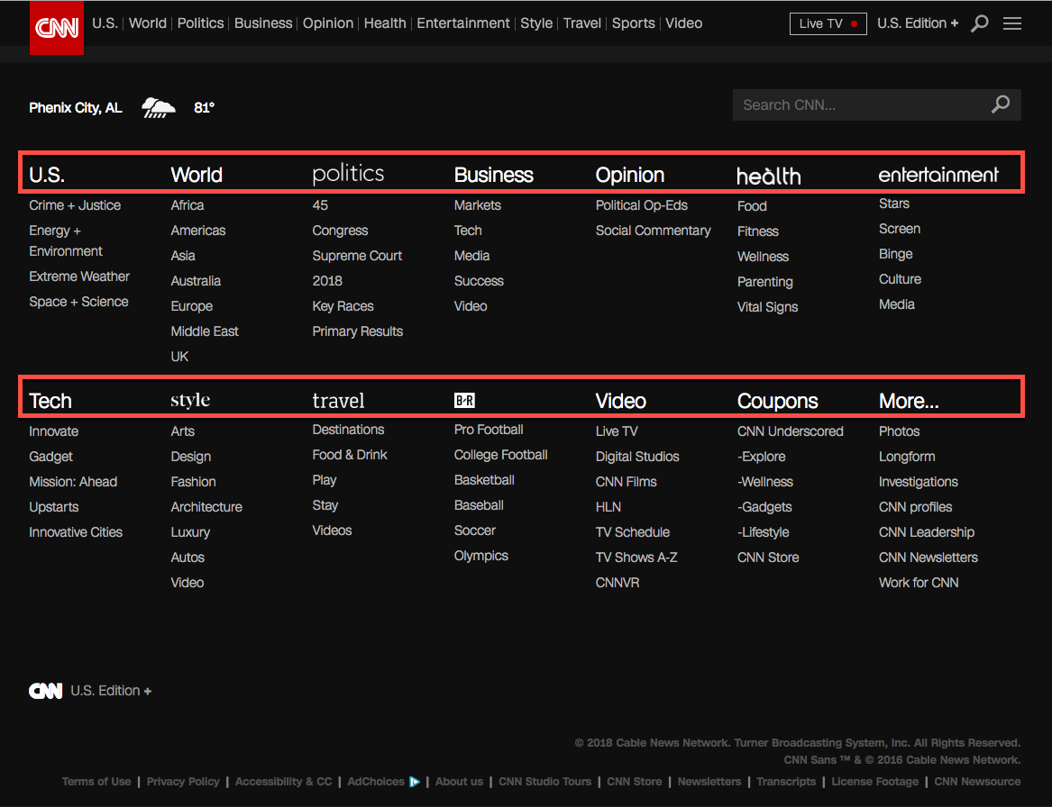
A site-map–styled footer component showcases a combination of the global navigation and other important pages not present in the global navigation. Unlike doormat navigation, it exposes lower-level subcategories of the main categories. It is helpful for:
- exposing underlying topics which are not obvious at the global-navigation level
- increasing awareness of the site’s primary content
- reminding users of the company’s offerings
A site-map footer component does not include the complete site map, unless the site has few pages (about 25 or fewer). Any more than that and the footer risks becoming unwieldy and difficult to use. (Alternatively, you can provide a full-featured site map on a separate page, and link to it in the footer, which is where users expect to find such a link.)
Use for: large sites with multiple levels of information or subdomains
Testimonials or Awards
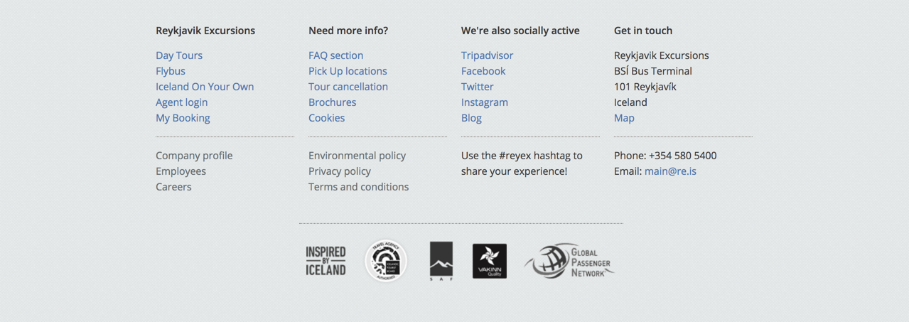
Many of our study participants described being motivated to pick a site based on the awards and testimonials received by that site. Highlighting accolades in the footer can be a good tactic when building authority and credibility. However, showing too many testimonials and awards could also raise a red flag for customers, giving the impression that the company needs to show testimonials because it is not mature or stable. A solution is to add this content to the footer.
Run usability tests and A/B tests with your audience to determine whether this strategy is appropriate for your footer, and what the right number of testimonials is.
Use for: startups or for companies with less brand awareness
Brands Within the Organisation
Some companies are so massive that they own or preside over dozens of other companies. Some use universal navigation to connect these child companies with the parent one. It can also be helpful to include a list of subsidiaries and brands in the footer to reinforce awareness of other brands or companies that fall under the organisation’s portfolio and also help users find their way around.
Use for: large, multinational organisations with many subsidiaries or partnered brands
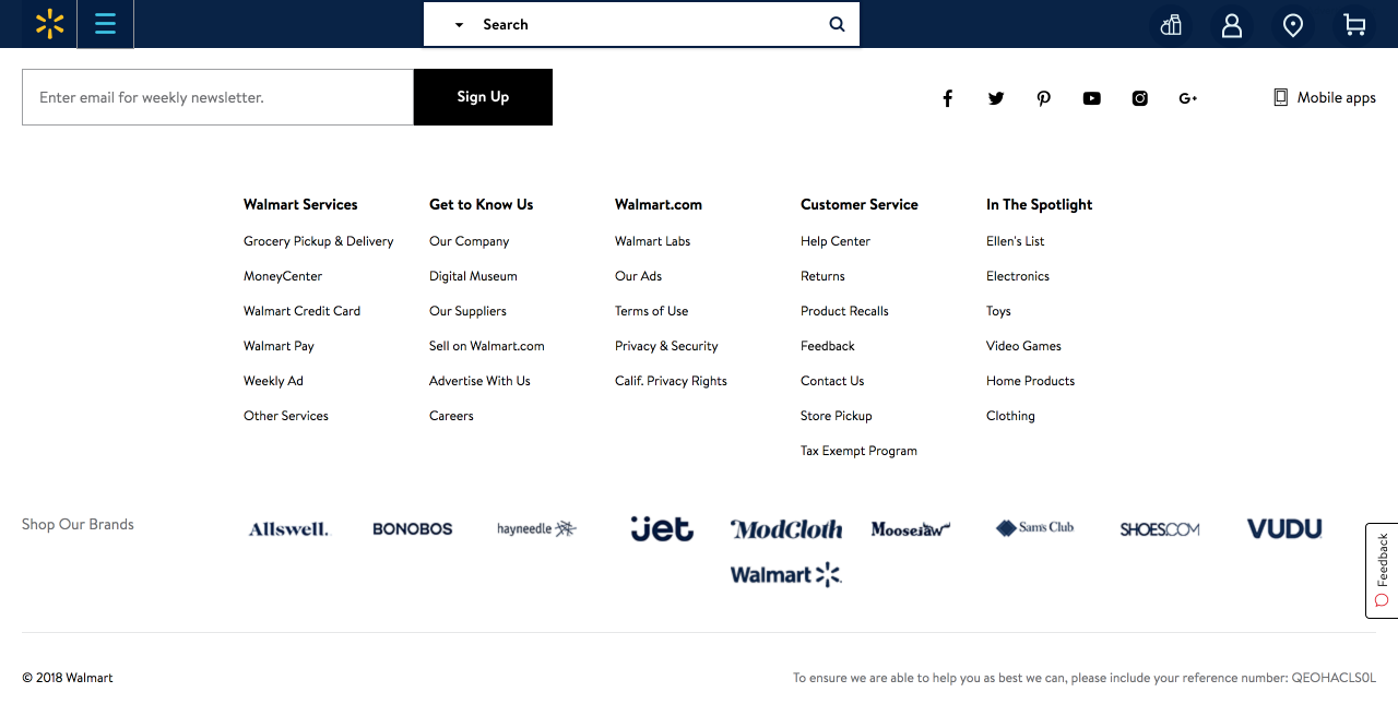
Customer Engagement
Users will often go directly to the footer to find information such as coupons and promotions or to simply staying up to date with the company’s sales and product releases. Thus, the footer can include information that allows customers to stay engaged with the company — social-media links (or at a minimum, links to the company’s social-media accounts) and mailing list signup prompts.
Before including an embedded social-media feed widget in the footer, consider how often the company posts on each social-media site. A less active social-media account may not warrant an embedded social-media feed, but might still benefit from linking to the social accounts.
Use for: all types of sites if using social-media links; sites with heavy emphasis on visuals or aesthetics (arts, beauty, lifestyle brands, or creative spaces) if using an embedded social-media feed widget

Variations on Footers
Infinite Scroll & the Mini Footer
Many e-commerce, entertainment, and other sites which encourage browsing opt for an infinite scroll in order to keep users on the page. Content continually loads so there is no consistent bottom on every page, and thus no footer section. However, the content that would have been in the footer (typically, utility-navigation links) appears as a “mini footer” in the right rail, or within a larger, expanded global navigation.
For the footer to be helpful it needs to be present on all pages of the site. Some sites try to utilise the same footer for both static-length and dynamic-length pages. However, when users attempt to use these footers on sites with infinite scroll, it often becomes a frustrating game of “whack-a-mole” where users try to click on links as quickly as possible before they vanish again below the fold. Instead, if you plan on using infinite scroll, consider placing a mini footer in the right rail and ensure that it is sticky alongside the main content as the user scrolls.
Use for: pages with infinite scroll
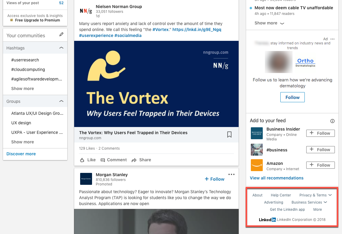
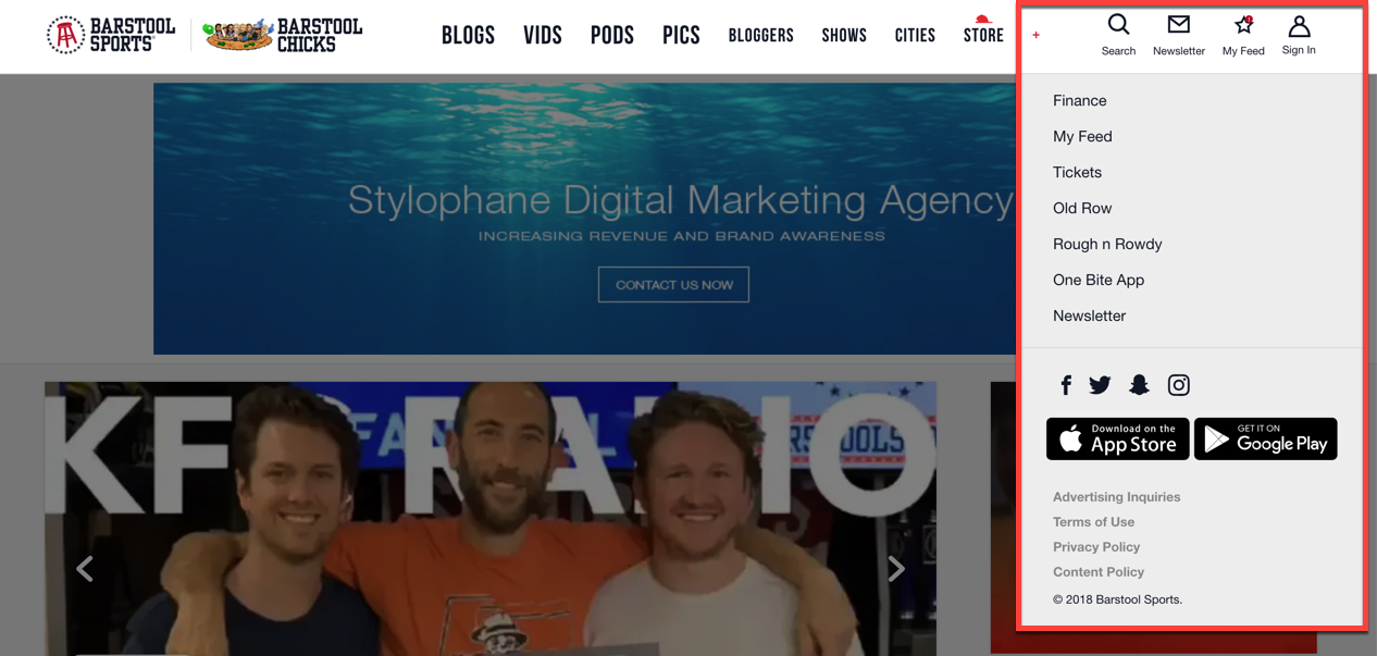
Barstool.com also has a footer that gets displaced as new content loads.
(In most browsers, hover over the video to display the controls if they're not already visible.)
Contextual Footers
While footers traditionally stay consistent across many pages, sometimes it can be helpful to customise the footer based on information that’s presented on the page. Particularly for a site with multiple audiences, a contextual footer can surface content that may not have made it into the global navigation, but might still be critical for some users.
For example, the Medium.com homepage does not have a footer; the page shows an infinitely scrolling list of articles. (The page has a right-rail mini footer as recommended above.) However, on a specific story’s page, Medium shows a task-based footer that varies depending on whether the viewer is a subscriber or not.
Use for: sites with different user roles (e.g. “content creator” vs “content consumer” or “member” vs. “nonmember”)

Common Footer Pitfalls (& solutions)
Footers have come a long way since the 1990s, but to this day, they are still subject to common design pitfalls:
- More than two levels of information hierarchy
Especially for large sites, including an entire site map is not an answer to your footer. A footer is a dedicated amount of real estate that should be devoted to only important information that should be discoverable. As my mother once aptly put it, “If everything is important, nothing is important.” - SOLUTION: Consider reprioritising the content and only displaying links to first- and second-level categories in your IA, not the entire site.[RB64] If a single lower-level page is important enough, surface that specific link in the footer, but you don’t have to show all levels of the information hierarchy to make it discoverable.
- Unclear link names in the footer (e.g. Company Info or Help versus Contact Us)
The notorious Resources link on many footers is one of the unfortunate vestiges of past footers. - SOLUTION: Teams should try to adhere to conventional, clear terms. If the team is unsure which term would be more appropriate, a card sort or usability test can help shed light on terms which may confuse users.
- Unclear structure or information hierarchy
The footer may sometimes be a “dumping ground” for orphaned links — that is, links which seem to have no relation to the global navigation or to secondary tasks. If the footer has no pattern of organisation, users will either do an exhaustive review or spend very little time looking at the footer.

- SOLUTION: Clearly convey the information hierarchy of the items in the footer by using grouping or other visual-design patterns that indicate visual hierarchy (e.g. bolded high-level page links and normal-weight lower-level page links).
- Hidden or illegible footers
Sometimes companies opt to use a tiny font size for footer links in order to accommodate all the links or to make the links less distracting. Worse, some sites might use an animation or accordion feature to hide the footer completely for aesthetics purposes. While the footer is not the primary navigation, people still use it and rely upon it, so don’t try to hide it.
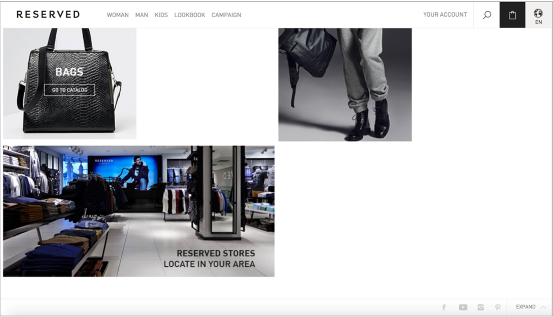

- SOLUTION: Use a legible font size and font colour (with decent contrast) and avoid using decorative fonts. Most importantly, do not hide or collapse the footer — people expect it to be there.
Conclusion
A footer is the place users go when users they’re lost. If we want to leave a lasting good impression, it’s critical that we don’t neglect the bottom of the page. After all, even the most mundane, utilitarian sections of an interface can make the biggest impact on a user’s experience.


